Introduction
It’s been said that some of the best insights into where you’re going start with understanding where you’ve been. With that in mind, let’s take a look at the history of the stock market. This is hardly the first time this has been done, but we’re going to put a unique Financology twist on it. We’re going to examine price, yield and return performance using different units of value.
Analysis
First let’s take a look at the returns on stocks so far this millennium. This view is in units of US dollars.
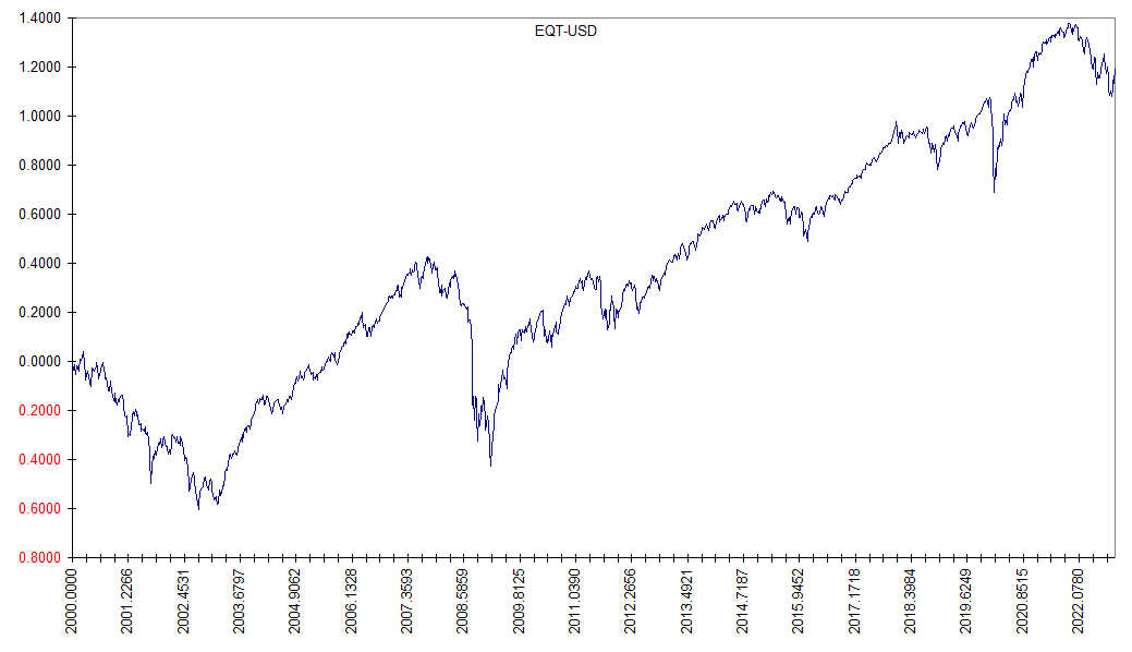
The vertical scale is natural log, with the beginning of 2000 set to zero. So the ending value of around 1.2 means you ended up with a dollar value of e1.2 times what you started with, a gain of about 220%. or roughly 5.4% annually. Most analysis will stop there … this is a chart of the return on stocks since the beginning of 2000. It is absolute and invariant. Given exact dates, you may be quoted figures to multiple decimal places.
The matter of units is usually not even mentioned. I will insist however that there is no such thing as a unique figure for stock market returns … it all depends on what units you choose to measure value with. You will get entirely different results for the same market if you choose euros, yen, francs, pounds, or yuan. Let’s try ounces of gold. This might be interesting because we know that an ounce of gold is exactly identical in 2020 to what it was in 2000. We cannot say that of dollars, euros, yen, etc.
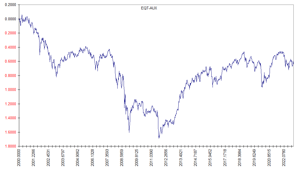
The first thing that stands out is that the returns in the first chart were overall positive … very much so. But not in the second. There we see we end up with capital of e-0.6 of what we started with … a loss of about 45% over more than two decades, about -2.6% annually. Simply by choosing a different unit of value we get an entirely different picture of stock market returns so far this millennium … wildly different.
But you might object … gold has no yield. Stocks do. What would that second chart look like if it included dividends?
It already does. In fact, if you had bought the stock market on January 1, 2000, reinvested your dividends, and otherwise not touched your nest egg until last week, you would have lost out compared to simply letting it sit in gold in a box.
By over 40%.
Over two and a quarter decades.
What happened? I thought that investing in productive business should always beat owning mere chunks of inert metal over the long run? And over two decades is much too big a chunk of anyone’s investing career to dismiss to short term fluctuations. What happened is simple … stocks were way overpriced at the beginning of 2000. Yes, it does make a difference how much you pay. And if you overpay, even the passage of decades will not bail you out.
Let’s expand our time horizon. Maybe we can still find support for our hypothesis about the long term benefits of investing in productive business.
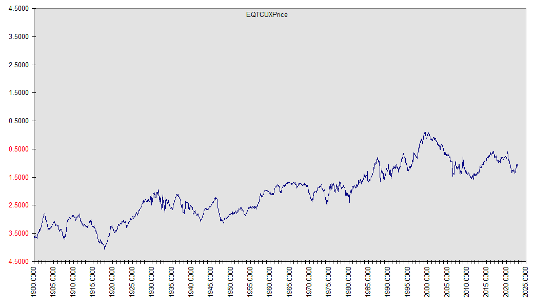
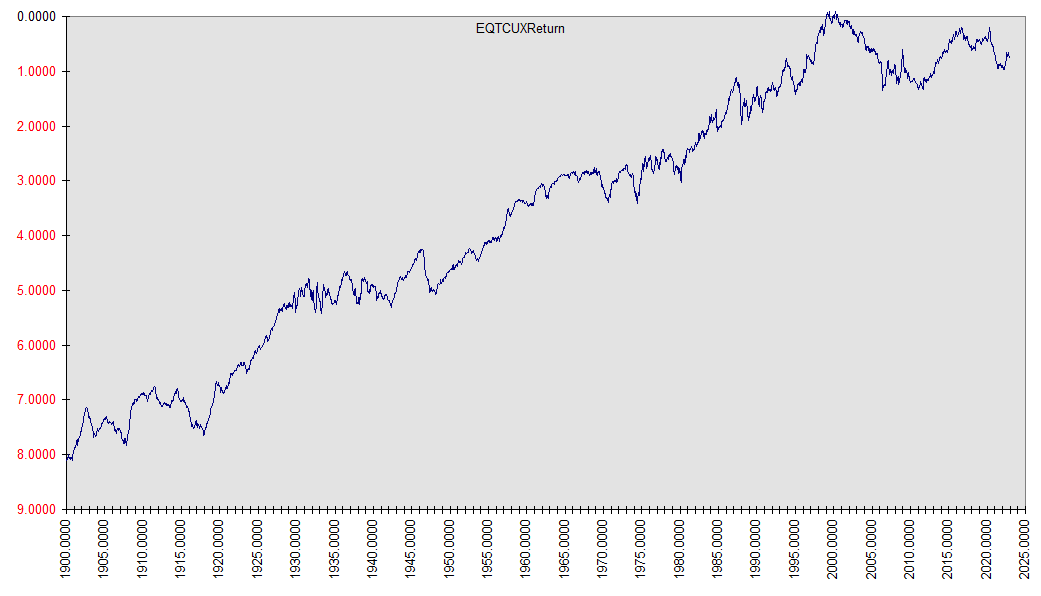
For this exercise, we’re going to go further back … much further back … another century. Since we’ve already established the near meaninglessness of measuring long term returns with depreciating money, let’s again use gold.
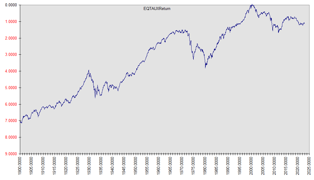
That’s more like it. Now we see that if we expand the time frame to a bit longer than most investors’ lifetimes, we can demonstrate the historic real returns of investing in productive business.
Again, we’ve included dividends in our returns. But just out of curiosity, suppose we just looked at price? Don’t most stock returns come from capital appreciation? I sure get that feeling from watching CNBC.
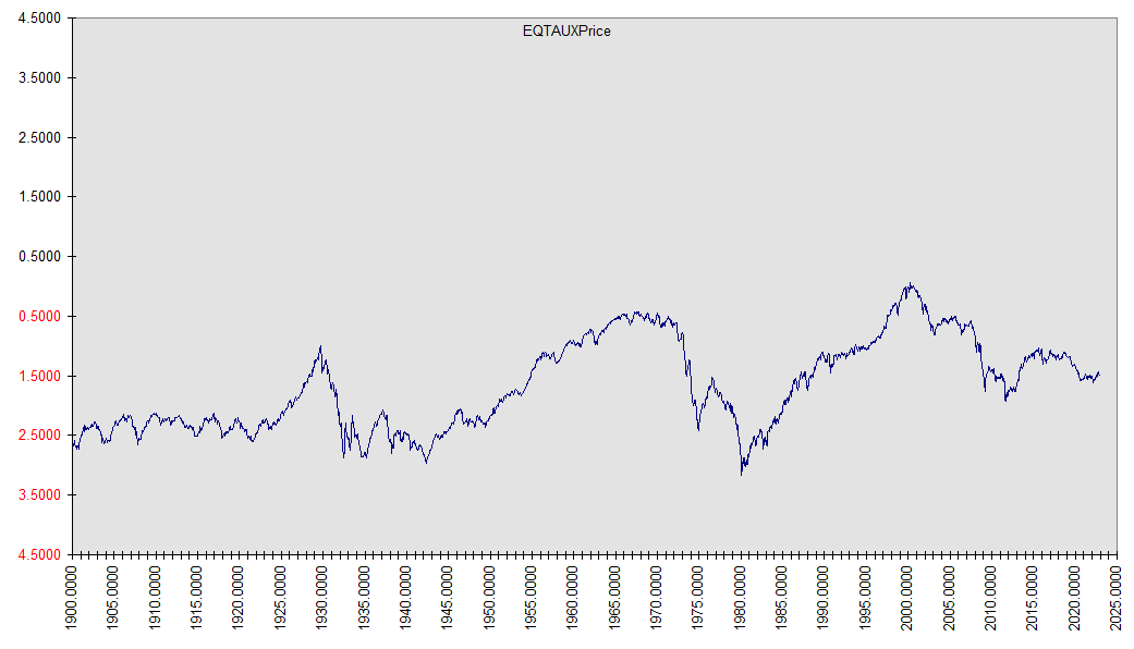
Okaaay … what happened there? Just looking at returns from “capital appreciation” left us flat … in 122.75 years we got … nowhere. Worse yet … stocks took us on a wild ride to get there. You may have read somewhere that dividends contribute meaningfully to stock returns. I beg to differ. They constitute virtually all long term stock returns. The much ballyhooed “capital appreciation” factor is nothing more than a figment of currency depreciation, aka inflation. We learned that from a simple change of units.
We promised at the outset that taking this little trip in the Wayback Machine would shed some light on what we might expect going forward. And, albeit in broad strokes, it does.
Look at the first two decades of the 1900s, comparing the last two charts. In this pre-inflationary era, stock prices were flat. Nevertheless, returns were generous. That’s because yields were generous. Stocks routinely sported high single digit to double digit dividend yields. If an investor got capital appreciation, it was icing on the cake.
And why were returns in the first two decades of the next century so poor? Due to ultra-high stock prices, dividends yields were paltry. By 2000, investors had turned their focus to “capital appreciation”. And when they did, it turned out to be illusory and evanescent.
Alas, here we are again. The yield on the US stock market is less than 2%.
Bear in mind that yield isn’t an inherent characteristic of a stock. It depends on price. If a stock pays $5 a year in dividends, what is the yield? It depends on what you pay for the stock. If you pay $100, the yield is 5%. If you pay $500, the yield is 1%. See where this is going? Stocks are once again too highly priced to offer much in the way of prospective returns.
We have to distinguish between sectors at this point, however. Because in the early 2020s, this too-high pricing is mostly confined to US stocks. Due to more favorable pricing, the rest of the world’s are yielding more than twice as much (3.67% versus 1.55%) … another way of saying you pay less than half as much for the same dividends. I discussed this in more depth in Where In The World Are The Cheap Stocks.
(Side note … although my point in that post wasn’t about immediate gratification, it’s interesting that in the thirty days from the date it was posted, non-US stocks have already beaten US stocks by 3.15%.
Because this figure is a stocks-stocks ratio, it is independent of units. For the curious, however, the figures in USD are US 11.63% versus ex-US 14.78%. They are based on the respective Vanguard total market funds VTI & VXUS.)
Since one change of units proved revealing, let’s try another. Above we looked at the price-only and total returns of stocks as priced in gold. Is there something odd about gold? Let’s try copper. Following are the price only and total return of stocks since 1900 as priced in copper.
This time we can make out a bit of capital appreciation in the price-only chart, although it amounts to but a small fraction of the total return we see in the second. But something else about these charts in comparison with their gold counterparts is striking. In the gold based charts, there was a huge runup in stock prices in the 1950s-1960s, followed by a spectacular crash in the 1970s. The copper based chart was relatively smooth by comparison. What happened there?
We took a closer look at this in Copper & Gold. In short, the market value of gold was suppressed by massive gold sales to support the dollar-gold standard prior to the 1970s. This standard was infamously abandoned by the closing of the “gold window” in August 1971. Like a beach ball held under water and then released, gold prices exploded in the 1970s. Copper experienced no such beach ball effects. The experience of this period has however led to an exaggerated reputation of gold as an “inflation hedge”. As we discussed in the linked article, it is indeed an inflation hedge, but as can be seen from the above charts, so is copper and so are stocks. Just not necessarily at the same phases of the inflationary cycle.
And while gold is a durable standard of value over multi-decade time frames, it is subject to peculiar influences over shorter time frames. Tryng other units can help identify anomalies. Notably, even using copper instead of gold, we still find negative total returns for stocks since 2000. This supports the conclusion that the negative performance since 2000 is real, not merely an artifact of exceptional gold performance.
Conclusion
Taken as a whole, this investigation indicates that genuine capital appreciation is not a significant source of return for stocks in general. The apparent market wide capital appreciation is nothing more than an illusion caused by choosing a depreciating unit of measure. In other words, it is the same “capital appreciation” as experienced by a loaf of bread, a gallon of gasoline, or monthly utility bill. In the aggregate, the real returns from stocks are almost all due to dividends.
One thought on “Making Stock Market History”