A little over two years ago, Financology forecast that the 2020s would see surging commodity prices. Our post Outlook for the 2020s made this prediction based primarily on fundamental and valuation grounds.
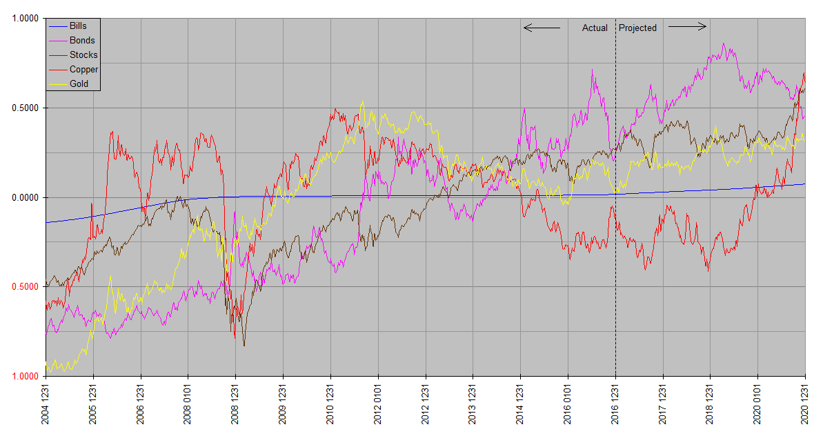
Of course every bull market is made up of a series of advances and declines, so we have been turning to our more technically based Synthetic Systems computer model to refine this by identifying the times at which rallies should be expected. Synthetic Systems predicted this inflation as long ago as 2017 … readers can consult the annual charts going back to 2018 on the Annual Charts page, where the 2020’s surging copper prices were fingered over two years in advance, before even Covid was on the radar screen. (Since the 2017 SS chart has expired from the Annual Charts page, a copy is reproduced below.)
At the beginning of this year, again, in Synthetic Systems Update 2022, as well as subsequent posts, we noted that industrial commodities had the highest return expectations of the five assset classes through the first three quarters of this year.
This week has been explosive. Bloomberg reports that its commodity price index recorded the biggest increase in five decades. The catalyst is all over the headlines … the war in Ukraine and the sanctions imposed on Russia in response.
How did Synthetic Systems foresee the outbreak of war in eastern Europe? It didn’t, of course. SS has no grasp of geopolitics whatsoever. The point we’re making here is that commodity prices were due to spike anyway. The Ukraine war and sanctions simply exacerbated a process already under way.
The more fundamental driver of soaring commodity prices is the central bank monetary excesses of the past fourteen years. SS of course doesn’t have an opinion on those policies either, but can read the fingerprints central banks have been leaving all through the financial system. SS is proof the seeds of the 2020s commodity and consumer price inflation were being sown at least as early as 2017. It’s noteworthy that even though Russia is not an especially critical copper producer, according to Bloomberg copper prices hit all time highs this week. It’s hard to avoid the impression that war and sanctions are being, if not outright scapegoated for reckless central bank policy, disproportionately blamed for surging prices.

Well, let’s just say, although late to the party, even though I had no excuse, I took out a copper position in January of this year. As of this posting, I’m extremely pleased I did.
As I may have already mentioned, I was already thinking about going long copper, but when I saw your SS charts, that confirmed it for me.
One very happy customer from Down Under.
BTW, I haven’t been able to find your subscription prices anywhere 🙂
Thanks, Peter. As you know, single commodities are notoriously difficult to trade. A chart of copper (in USD) shows that although it has been in a broadly rising trend over the past year or so, it is also prone to sudden spikes and dips. Buying on a spike or selling on a dip can easily overwhelm the benefits of the larger trend for a while. For this reason I usually limit copper itself to a relatively small portion of my commodities allocation. Instead because most physical commodities tend to correlate over the medium to longer term, I spread my commodities allocation out to include other metals like silver and platinum, and other industrial commodities including energy and agricultural commodities, both via producer stocks and futures based commodity index funds. This makes for a smoother ride less sensitive to individual commodity volatility.
The Synthetic Systems Copper plot is best read as an indicator of industrial metals and other commodities more generally. I use copper specifically for the computer model because copper best represents the central tendency of the class over most time frames while avoiding the problems of arbitrarily assigning weights to individual commodities. Among the commodities it also has one of the longest records for which price information is available. It also serves as an excellent indicator of inflation trends, helping to account for its reputation as Dr Copper, the metal with a PhD in economics. It was the soaring 2020 copper plot that first appeared in the four year SS chart back in 2017 that tipped me off to the unleashing of this wave of inflation we’ve been witnessing.
Long time followers may recall that up until a few years ago, SS combined gold and copper into a single commodity index plot. As I reviewed the data it became clear that their behavior was too different to continue justifying this. While both commodities have a history of use as money and both have industrial uses, they are polar opposites in terms of gold being the most strongly monetary and copper the most strongly industrial of the physical commodities. Breaking them down into separate components contributed improving the quality of SS analysis across all asset classes. In an inflationary environment, I expect both commodities to do well, though not generally at the same time.