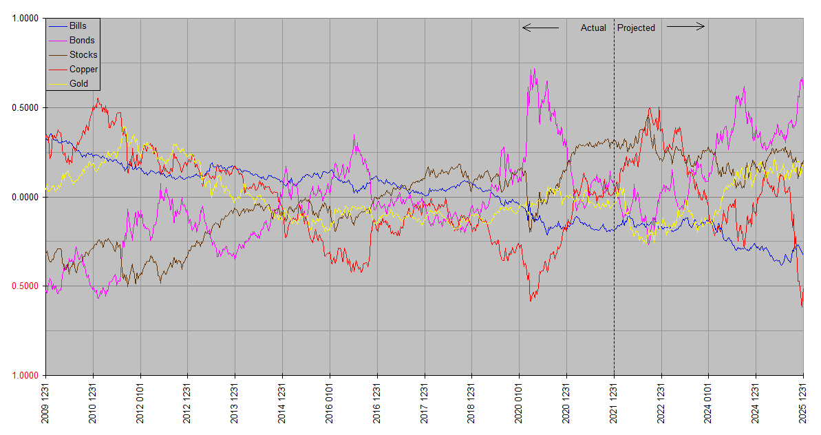
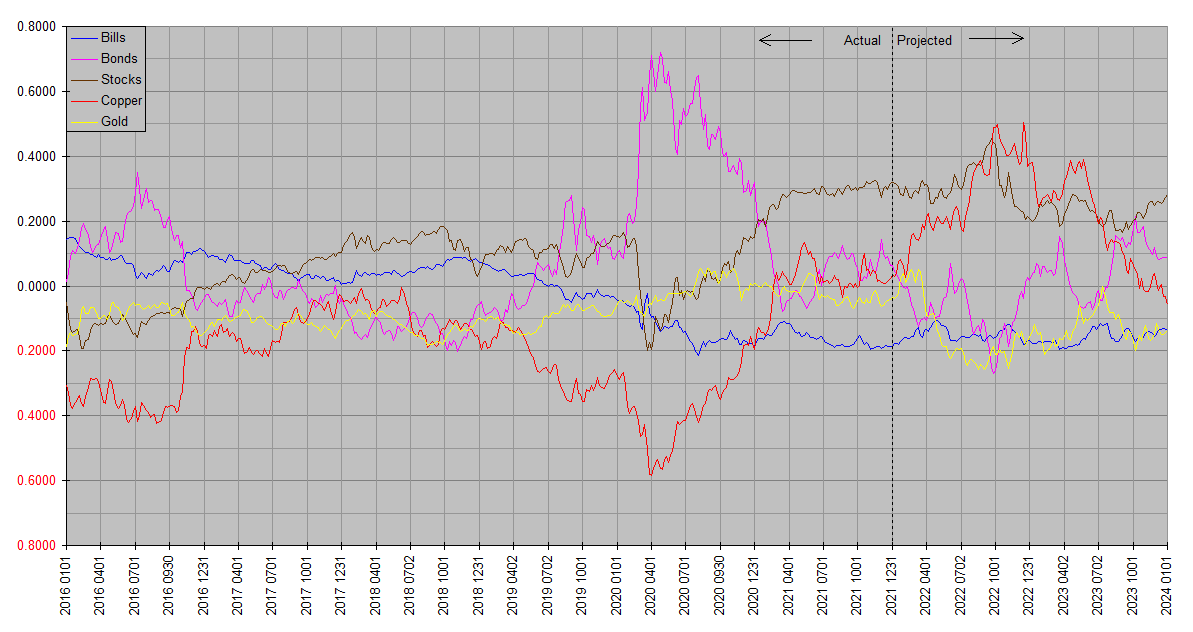
Happy New Year! We all want to know … what to expect from the financial markets in 2022 and beyond. Just minutes ago I ran the latest Synthetic Systems update, which on the occasion of a new year includes not only fresh quarterly forecasts but a new four year annual outlook.
The latest charts appear on the Market Analysis page, along with an archive of the past four of each. Among other things, this allows us to visually compare sequential charts and see how past forecasts have worked out. In the spirit of a picture is worth a thousand words, the latest charts are also reproduced below. As a reminder, the annual charts are named with whole numbers while the quarterly charts are decimalized.
Synthetic Systems is an original modeling algorithm designed to give a broad picture of the financial markets history and outlook. For this purpose, these markets are represented by four asset classes: US TBills, US TBonds, Equities, and Commodities. US TBills is calculated at a maturity and duration of zero (no principal change with changes in interest rate), and effectively represents Treasury money markets, US dollars and “cash equivalents”. US TBonds is calculated at infinite maturity (interest only, zero coupon duration reciprocal of rate) and effectively represents annuities and the longest maturity Treasury bonds. Copper and gold represent physical commodities. Readers may recall that copper is included not only in its own right but as an indicator of the broad physical commodity complex. Equities includes all stocks, foreign and domestic.
The charts show natural log total return, so that the vertical scale roughly represents percentage changes. This design puts all of the asset classes on the same footing; it doesn’t adopt the confusing media artifice of reporting of some assets in terms of price and others in terms of yield; total returns are directly comparable. One of the more subtle aspects is that returns are not shown in dollars, so that dollars themselves can be plotted as an asset class, effectively identical to short term treasuries at zero interest rates. Instead returns are relative to each other in terms of a weighted mean, so that they are essentially cumulative real returns. The vertical scale is relative; the asset class plots are vertically positioned to fit within the same window. So the essential information is in the slope of the plots. Intuitively, up indicates outperformance and down underperformance.
The annual charts are run at the beginning of each year, and cover the past twelve years and the next four. The quarterly charts are run at the beginning of each quarter, and cover the past twenty four quarters and the next eight. The charts are high resolution so can be liberally zoomed for a closeup look. Be wary though about putting too much emphasis on forecast detail; SS often does get the short term right but is at its best over time frames of a couple quarters and up.
Synthetic Systems charts are designed to be as intuitive, self contained and self explanatory as possible, but they pack a lot of information and their meaning may not be immediately obvious to those unfamiliar with them. You should feel free to reply with any questions on the interpretation of Synthetic Systems charts.
Synthetic Systems 2022

Synthetic Systems 2022.00

thanks. i’m always interested in seeing these.
looking at bonds and commodities, it seems that this is predicting a 2 year recession starting late this year. otoh equites are fairly stable over that period, supported i suppose by dropping interest rates and t.i.n.a. how much would you consider that an over-interpretation?
It’s a fair reading of the charts, JK. Personally I try to avoid the term “recession” because it’s not well defined … as I understand it it’s usually taken to mean whatever the National Bureau of Economic Research (NBER) says it is. Not to mention its declarations are always ex post. Or that it arbitrarily reduces a whole spectrum of numbers to a single binary variable. Junk food for the economic mind.
What is clear is that Synthetic Systems expects a distinct inflection in the financial markets in the second half of this year. In terms of commonly reported econometric data, “inflation” abruptly vanishes. SS is not good enough to tell us whether this will be something akin to the deflationary crash of 2008, or something milder, or for that matter more severe.
One way to put it into perspective is to compare the SS outlook with that of Steve Blumenthal at CMG Wealth. Drawing from the likes of Lacy Hunt and David Rosenberg, he says
“The investment picture going into 2022 is the relatively high probability the global economy will slow dramatically from the stimulative-driven pace we are now exiting…
2022 Outlook
A difficult first half of 2022 with the potential for a 30 percent or greater market decline.
Fed responds aggressively and the equity market bottoms. Strong second half 2022.
Similar to inflation cycles of the past, some moderation in inflation into mid-year. Inflation picks back up in the second half with the return of Fed Quantitative Easing (QE).
Bullish outlook for 10-year and 30-year Treasury bonds. The 10-year yield may decline from 1.5% to 1% in the first half of 2022.“
To sum it up briefly, SS sees a roughly similar picture, but says it’s not a first half event, but a second half event. It certainly does not see a “strong” second half.
Thanks for this Bill and Happy New Yes.
In the Permanent Portfolio Harry Browne recommends an even split across 4 assets and an annual rebalancing (a failsafe approach) What might be a wise approach bearing in mind Systems is showing a significant outperformance in Copper during 2022? Also how would you approach this based on your time in life?
For example a young saver who is lucky enough to have savings of $30,000 but has their whole working and savings potential ahead of them in comparison to someone who is beginning to wind down their working life and has substantial savings already.
Happy New Year Llanlad2! In 1999 Harry Browne published “Fail-Safe Investing” in which he described a “Permanent Portfolio” of equal parts cash or TBills, long term TBonds, gold, and US stocks. Financology refers to it in the Investing Basics section. Browne took a very much “no exceptions” view towards this allocation, but I sometimes wonder if he wouldn’t make some adjustments given the extremes in today’s financial system.
At least I do. Some adaptations themselves are permanent; for example I use global stocks in place of US stocks. Others may be merely long term … the risk return proposition from long term Treasuries is extraordinarily poor with yields near zero and unpayable and rising debt. Still others are cyclical, based on the Synthetic Systems outlook.
I do follow the spirit of Browne’s work insofar as I make a point to never have no allocation at all to each the four asset classes; and use the Permanent Portfolio model as an especially simple approximation of the Global Market Portfolio, and as a benchmark to assess what risks I am taking. In other words, if my allocation is overweight A and underweight B relative to the Permanent Portfolio, at least I know that I’m making a bet on the outperformance of A and underperformance of B.
The main effect of investor age is that younger investors have more capacity to take risks than older investors. That’s often assumed to mean they should have more in stocks. In some cases I’d agree, but in general I don’t buy the simplistic assumption that stocks=risk and bonds=safe. For instance at these prices long term bonds are highly risky. Risk comes more from poor asset allocation than any single asset class.
It’s also often assumed that stocks are inherently higher return investments than bonds. Simply not true. Long term Treasuries have actually outperformed stocks since the turn of the millennium. Gold comes in second; stocks third. You won’t hear this on CNBC. Most financial media don’t even quote bond returns, only yields. Junk food for the financial mind.
I use Synthetic Systems data to overweight and underweight asset classes +/- a few percent, depending on the degree of conviction in the outlook, in addition to my assessment of the long term fundamentals. For example based on the current SS outlook I’m going underweight gold and overweight industrial commodities related assets (a little copper itself, but mainly energy and ag stocks). Underweight long term Treasuries, overweight cash and short term Treasuries. Of course that will change with the passage of time … as I remarked in introducing the charts, a picture is worth a thousand words.
your long term annual systems projection is in good company:
https://twitter.com/Halsrethink/status/1477431597695700993?s=20
i know you don’t like to use those words, but they map pretty well to your graphs right through the end of 2025
Thanks, JK. No problem on the terminology; I just have to get those little economic pet peeves out of the way when they come up;-).
A sensible fundamental case concording with an SS forecast is always a confidence booster. I take SS forecasts with a grain of salt if they can’t be made to make fundamental sense. That doesn’t often happen though; in fact often the fundamentals aren’t apparent until well after SS expects something. Most notably in SS foreseeing the 2021 inflation as long ago as 2017. Who’d have guessed the Fed would be cranking out those trillions? I was skeptical of it myself until the pieces started to fall into place.
Main thing I’m on the lookout for right now is that trend reversal in the second half of this year. The fundamental ingredients are developing. The Fed is rapidly withdrawing QE and is earnestly talking about rate hikes. It’s never a sure thing until it happens, but I’m already trimming risk around the edges.
It’s nearly impossible to find knowledgeable people on this topic, however, you sound like you know what you’re talking about! Thanks
I want to to thank you for this wonderful read!! I certainly loved every little bit of it. I have you book-marked to look at new stuff you post…