I admit it. I’ve grown obsessed with bonds. The ongoing disaster fascinates me the same way a traffic accident does passersby. Earlier this week, I posted a price chart of the broad US Treasury market, proxied by GOVT, which we again reproduce here. This crash is unprecedented at least as far back as 1980.

Like the multi-trillion-dollar Treasury market itself, this fund is heavily weighted in the short end of the yield curve, and so normally doesn’t fluctuate wildly in price. But it’s about 20% off its 2020 highs. The widely followed TLT, focused on the 10-30 year maturity range, this week reached 50% down from its 2020 top. If it had been stock prices cut in half, Wall Street would be declaring the end of the world.
But the aim of this post is to defy my usual sunny disposition and look at the half full half of the glass. As a price chart, the above only tells half of the story. The seller’s side. And what’s a disaster for sellers is a bounty for buyers. Looking at the yields now available to them snaps this into focus.
So let’s do that. I’ve charted here the distribution history of GOVT since 2017.
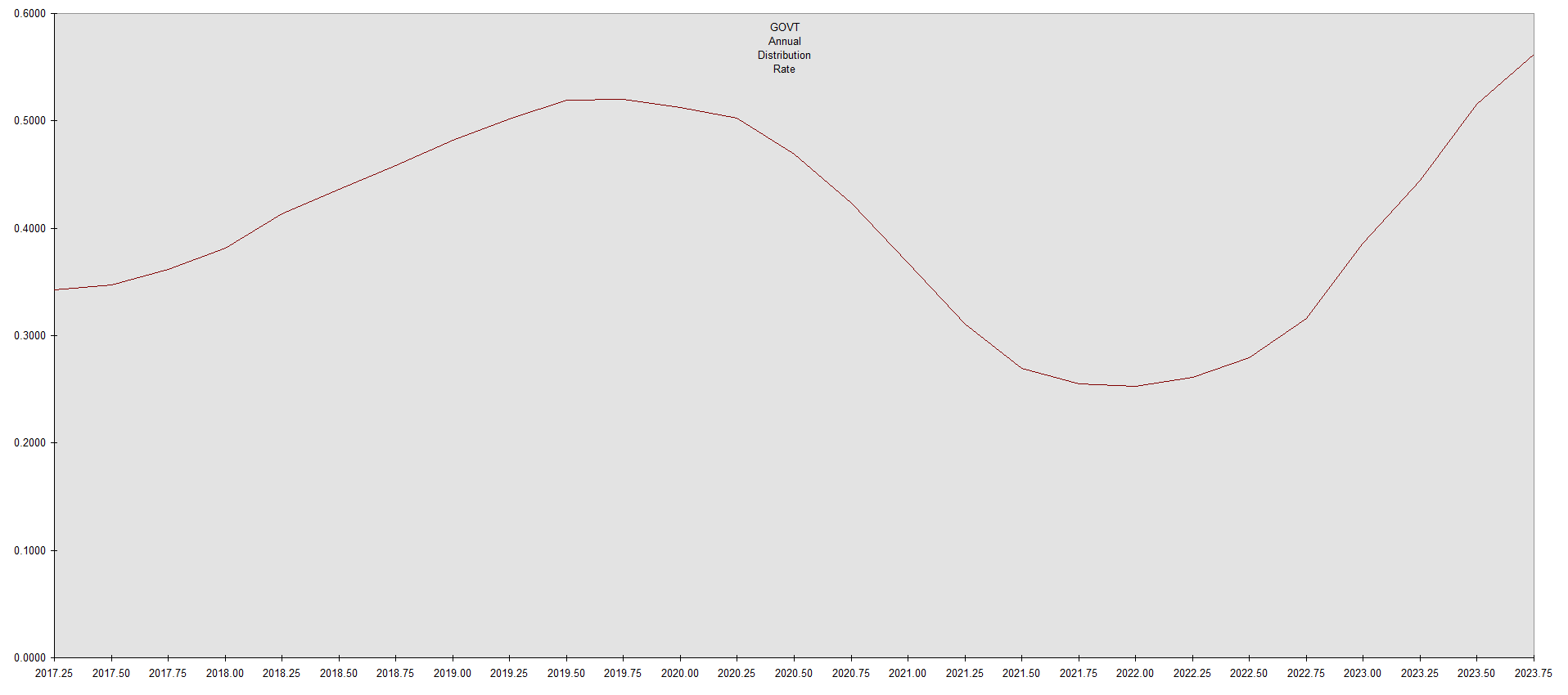
This is the trailing annual distribution, in dollars per share. It’s not a percentage yield. Unlike owning individual bonds, yield has increased not only because of falling prices, but much more due to the absolute increase in dollar distributions you see here. Yield has price in the denominator, so as the price of the fund has declined, the yield has increased even more than the slope in the chart suggests. But this boring old Treasury bond fund has been growing its actual distributions at an annual rate in excess of 10%. Enough to leave most dividend growth funds in the dust.
Where else can you find guaranteed income rising in excess of 10% annually?
Skeptical readers will object that this growth rate will not be maintained. Of course it won’t. Not indefinitely. But it will continue for a while. Because of the broad range of maturities, higher yielding bonds are still entering the portfolio pipeline as lower ones exit, causing fund distributions to lag around a year or so. In addition, because the plot is of trailing annual distributions, it’s delayed by half a year on the time axis. (So the plotted distributions bottomed about a year and a half after Treasury yields.) Those distributions will keep rising for a while. If Treasury yields continue to rise, for quite a while. For income investors, the Phoenix is rising from the ashes.
Nothing lasts for forever, of course. The dividends will eventually peak and turn lower. But well before that happens, the share price will rise, so traders will have an opportunity to sell on strength.
The main longer term risk is that the issuer of the underlying securities, the United States government, goes bankrupt and defaults either through overt failure to pay or via hyperinflation. But in such circumstances, everything else will be going to hell along with it. Except for gold.
Hedge wisely.
if I’ve got the numbers right, at its current price with the trailing dividend govt is paying about 2.6% is that right? so not quite a bonanza
It’s the Wayne Gretzky method: “Skate to where the puck is going.” Same rationale as dividend growth funds.
Except this is a rare case in investing where you actually know where the puck is going. Recall the above discussion about lags. Even if UST yields fall from here, although the fund share price will rise immediately, the fund distributions will continue to rise.
Your numbers are right, but reflect where the puck has been. Today’s buyers will not receive last year’s distributions, so a trailing yield is unmeaningful. For a forward yield, you have to look here: US Treasury Yield Curve. Subtract 0.05% fund expenses.
So you can about double that.