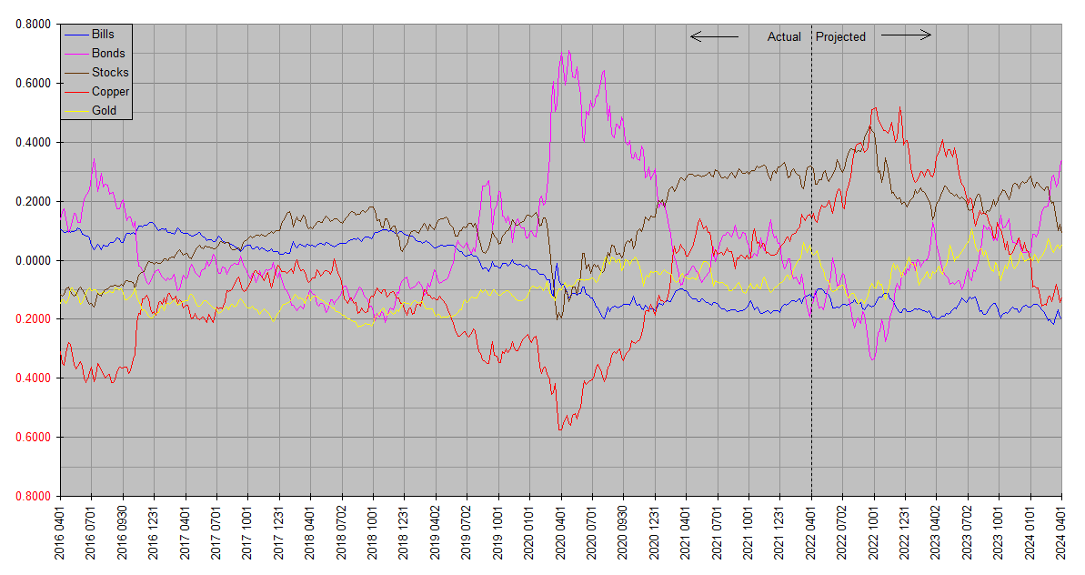
The latest quarterly Synthetic Systems chart appears below.
A few reminders. Synthetic Systems is a computer forecasting model covering five asset classes: Treasury bills, Treasury bonds, stocks, copper & gold. The plots are all on the same basis so as to be directly comparable: Total return. So the slope of one asset rising more than another indicates outperformance, and vice versa. Plots are in natural log space so that the same vertical increment means the same proportional (percentage) increase regardless of vertical position. The total returns are not denominated in dollars or any other currency, but are relative to each other.
Bills refers to US Treasury securities of effectively zero maturity and duration. Bonds refers to US Treasury securities of effectively infinite maturity (duration reciprocal of yield), but approximates the returns of real world long maturity Treasury funds like VGLT and TLT. Stocks refers to the entire asset class (not just US or any one country). Copper and Gold represent the respective elementary commodities, except to note that while the Copper history is pure copper, the forecast better represents industrial physical commodities as a class and is broadly indicative of trends in goods and services price inflation.
The charts are best considered together. Annual and quarterly charts are respectively grouped together on dedicated pages under Market Analysis to facilitate this. The forecasting accuracy of Synthetic Systems is best evaluated by comparing successive charts, as the “Projected” time frame of an earlier chart slides to the left into the “Actual” time frame of later charts.
Readers should bear in mind that Synthetic Systems forecasts comprehensively reflect financial and economic forces (e.g inflation, interest rates, monetary policy, money flows, seasonality, natural resources, technology, demographics, the business cycle, global economic trends, consumer sentiment, investor psychology, momentum, mean reversion, etcetera), but do not reflect external noneconomic factors (e.g. natural disasters, pandemics, unexpected geopolitical disruptions) until they are incorporated into the financial and economic sphere. It’s most applicable over time frames from one quarter year to four years … its accuracy is limited by noise and news flow on time frames less than a quarter year, and it also does not attempt to model drivers of long term (in excess of four years) returns such as valuations. Readers are encouraged to consider Synthetic Systems forecasts in conjunction with fundamentals and valuations.
Synthetic Systems 2022.25
thank you for this. i’ve been really curious to see how gold’s trajectory changed from your last forecast. commentators have wondered why geopolitical discord hasn’t shown up in the price of gold. your projections would imply it DID show up by keeping gold as high as it is in spite of whatever forces your model expects to drive the price down. i also note that stocks and commodities are now predicted to have cleaner rises than in earlier runs.
alas, all runs say again and again that we’re headed for a tumultuous 4th quarter. what’s your feeling about the accuracy of the timing in your quarterly models?
Wow I wish I had a shorter answer … but the only short one would be it is what it is. The best way to assess SS forecasting accuracy is to compare successive forecasts along with the outcomes included in the charts. To make this convenient they’re collected and displayed together on the respective Annual and Quarterly pages.
At the risk of it sounding like a cop-out, by design Synthetic Systems doesn’t handle unexpected geopolitical events well. It only sees them through their effects in the economic and financial arena. This includes things like sudden outbreaks of disease, war and natural disasters. A “big one” at the San Andreas fault for instance would also be beyond the scope of SS. It has no inside line into virology, military minds or plate tectonics. Only once their traces are left in financial and economic data are such things assimilated into SS and reflected into future forecasts.
You nailed it with your observations on gold … SS forecasted a much larger selloff in gold – in the neighborhood of 15-20%, and we only got around 7-8% – after a sharp rally. A perfect example of how the geopolitical wasn’t baked in. An abrupt end to the war would also fall into this category … in such an event gold could very plausibly respond by returning to the earlier projected trajectory.
Yet expecting an outcome exactly as SS forecast would be unrealistic anyway. It doesn’t resolve well time frames less than around a quarter. I only leave that much detail in the plots because it’s still better than random. The broader trends are better still.
I do expect a major trend change some time in the third or fourth quarter. We still have another update or two before then, though FWIW I think it’s significant enough that I’ve already begun to prepare. Recent developments in the yield curve are beginning to fall in place pretty much as you would have expected based on the SS outlook.
Thank you for the update, Bill. I’m trying to imagine what would make commodities begin such a decline at the end of the year and what would make bonds suddenly so attractive when our gov’t has such unsustainable debt.
Good question, Shiny! Synthetic Systems doesn’t tell us why it thinks what it thinks, but the fundamentals that might lead to the outcomes it foresees are as important if not more so than the immediate investment implications.
We can imagine possible scenarios. There’s considerable latitude for interpretation … mine goes something like this: Inflation due to many years of hyper-easy monetary policy has until recently been confined to asset prices. Over the past couple of years it has finally spilled over into consumer prices. This is forcing it to be recognized for what it is, prompting a bear market in bonds and a policy response. Falling bond prices and rising yields and interest rates over the course of 2022 in turn force a deleveraging. The supply of money falls relative to demand and its cost rises. This – at least for the next year or so – successfully reigns in inflation.
So for now at least, the battle against inflation will be won. As we discussed before, inflation shows up first in asset prices. There is considerable variation from cycle to cycle, but generally moves from bond prices into stocks, and over a period of years, finally into consumer prices and wages. This goes into reverse in 2022, with bond prices falling first, followed by stocks, with consumer price inflation slowly trailing behind.
Commodity prices – being set in real time markets – could fall quickly as leveraged players unwind positions to raise cash. This would be not unlike what we saw in 2008. Recall consumer price inflation rose sharply into the middle of 2008, with oil prices reaching $147 a barrel shortly before Fannie and Freddie were taken into conservatorship. Only weeks later, Lehman Bros infamously imploded. By the end of the year, oil was around $30.
I’m not forecasting a repeat of 2008, but a similar outcome can’t be ruled out. It could be milder. Unemployment need not rise much at all … labor demand could mostly just ‘catch down’ to supply. But given that the inflation problem has been allowed to get much further out of control this time around, it could also be much worse.
Of course SS doesn’t “think” like this … here I’m just sort of reverse engineering a set of fundamental circumstances that would fit with what we know has happened and what SS thinks will happen.
Bill, your hypothetical scenario of deleveraging with interest rates rising sounds very plausible. But usually when we see interest rates rise we see deleveraging in equities. SS shows equities falling for a quarter, then leveling out while commodities continue to fall.
I’m looking forward to the next couple quarters from Synthetic Systems to see if (or how quickly) the trend reverses. Your system is fascinating. Sincere thanks for sharing it!
PS- not that my opinion amounts to a hill of beans, but it seems like “leverage” is always an outsized contributer to the boom-bust system.
The term “leverage” is essentially a word for people shorting (borrowing) dollars. When dollars are losing value (inflation), it’s a profitable trade. But once too many people are on the same side of the boat, it lurches the other way, and people rush to cover their shorts (“deleverage”). Dollars rise in value (deflation). Boom and bust.
“SS shows equities falling for a quarter, then leveling out while commodities continue to fall.”
Frankly I’m puzzled by that too. Most of it is a few quarters out though, and is likely to evolve with future updates. Usually the general form of the out quarters is pretty stable but the details drift.
The nearer term stock rally is a bit puzzling too … it’s difficult to fit a narrative to. Maybe it’s just a lack of imagination … or maybe the forecast is just wrong.
The main feature of interest right now is the regime change seen around late third quarter … major trend reversals across the board. It’s unlikely SS is showing us everything in HD … as a general proposition, with as many variables as it covers the chances of it getting all of the details exactly right are somewhere around the odds of winning the lotto jackpot and getting struck by lightning on the same day…
Bill, a question to ensure I’m at least understanding the graph correctly, if you don’t mind:
Q1. Stocks reach a peak around 0.45 before the end of the third quarter. Then, they drop to approximately 0.2 by end of fourth quarter. So, this is a drop of 0.45 – 0.20 = 0.25; is this 0.25 a drop of 25%?
I just want to ensure that I’m at least interpreting the graph correctly. I understand you’ve stated that it could be more or it could be less. But if it unfolded exactly as shown on the graph, does this mean a 25% drop in stock?
Thanks, Peter (aka Down Under)
Yes, Peter … the vertical scale is calibrated in natural log. This results in the percentage change being about 100 times the vertical scale.
For exact percentage changes, exponentiate the vertical change. So a change of -0.25 would equate to exp(-0.25) or e^-0.25 = 0.77880078…, or −22.119922…%.
Conversely, a change of +0.25 would come to exp(0.25) or e^0.25 = 1.28402542 or +28.402542%.
Remember though all the plots are relative to each other (specifically to a weighted mean of all five), so that for dollar changes when Treasury bill yields are zero, you need to subtract the change in the Bills plot. This may seem like an unnecessary complication, but without it the Bills plot would be smooth, implying that the dollar itself is unchanging (compare with the 2018 & 2019 annual plots, which were denominated in dollars) which we know not to be the case. The current (also the original) method reveals movements in the dollar itself and also makes the SS processing more accurate.
1. i’ve been assuming that the ’22q4-’23q1 shifts are predicting a recession.
2. i have a question about copper and other commodities. i can certainly see that copper would be highly correlated with other industrial metals, and with lumber. copper is also highly correlated with oil.
but how about agriculture? from 2016 to the present agriculture, at least as represented by the etn rja or etf dba, has underperformed copper. in a recession the reverse might be true. from 2008-mid 2009 indeed agriculture outperformed copper. so as i research and write here, i’m beginning to think that an industrial metal – agriculture barbell would reduce the volatility inherent in commodities.
Yes it might turn out to be called a “recession”, although that would be secondary to an increase in the dollar’s value (deflation). Unemployment might rise, but not necessarily … the current state is that labor demand exceeds supply, so it could only be a matter of demand “catching down” to supply. It might also look like negative growth because when inflation is rapidly changing conventional measures don’t keep up, leaving it possible for too much inflation to be backed out of nominal GDP. This issue is discussed in greater detail in What Is Economic Growth?.
Your observations about industrial and agriculture commodities nail it. In fact that’s how I approach it myself. Combining metals and ag coms reduces volatility. I also throw in energy for good measure.
All these physical commodities are highly correlated over the longer run. But they can diverge substantially in the short to medium term, so a diversified mix tracks the broader trend while some of the shorter term volatility gets canceled out.
As far as asset prices go, however, there will be no “soft landing”. A decline in asset prices is a prerequisite for timely taming consumer price inflation.
Hi Bill,
Thank you for your detailed response to my question. I felt I was misunderstanding something and glad you clarified it for me.
As an aside, do you think you should have your answer as “A Primer To Understanding The Graphs SS” produces, along with other information? I’m sure there must be others who look at these graphs and decide they’re too hard to make sense of or worse, think they understand, when they don’t really.
Just a suggestion.
Yes … the Market Analysis page has an explanation of Synthetic Systems charts, and this article does as well. There’s also an article on it at Interpreting Synthetic Systems. I don’t want to put too fine a point on exact magnitude changes in the forecasts though because they’re not that accurate … the essence of them is in the relative movements between the asset classes … Y outperforms X and so on. Even if the reader had the actual source data and calculated the exact changes, with the number of discrete forecasts embedded in the charts the probability they’d all be exactly right would be somewhere around the odds of winning the lotto jackpot and getting struck by lightning on the same day.
Once again, thanks for your reply pointing out where I may obtain further information.
On a slightly different topic, if you don’t mind answering, when you say you’re overweight or underweight a particular asset class, what constitutes overweight / underweight for you?
Obviously, feel free to pass on that one if you don’t wish to share.
Interesting question, Peter. I like those terms because a neutral weight would be different for different people. For someone in their twenties investing for retirement a neutral allocation to equities would be higher than someone in their eighties. It would also vary according to other personal financial factors like debt. Someone who rents as opposed to owns their home might also add more real estate than is included in the broad equity indices.
It might also vary according to how finely one wants to tune their portfolio. Most investors can just buy three assets (gold, sovereign bonds, and global stocks) and be well diversified. My neutral weights also vary by long term outlook, with “underweight” and “overweight” used to describe adjustments for medium term outlooks mostly based on Synthetic Systems. Overall, since 2020 neutral for me has been 20% elementary commodities, 20% USD & UST, 20% US stocks, 20% ex-US stocks and 20% individually selected stocks (mostly commodity related land and residential realty). You can look at it as an adaptation of Harry Browne’s Permanent Portfolio.
The stocks part includes Vanguard’s global stock fund VT, so that when I want to be underweight or overweight stocks I can just decrease or increase that position as opposed to having to adjust multiple individual ones. iShares’ GOVT can serve the same purpose for Treasuries. The elementary commodities class includes 1% copper, so overweighting copper might mean raising it to 2% or so, while increasing positions in a range of commodity oriented stocks. For example in light of prior SS forecasts, I used a small copper overweight as a supplemental move to augment a deep underweight in bonds at the beginning of this year as well as buying farmland and energy stocks. Then recently I brought bonds back up to neutral, but so far still maintain the overweight in industrial commodities.
thanks for the elucidation…